Council on Accreditation
Accreditation Made Friendly
The Council on Accreditation accredits over 2,000 private and public organizations and programs that serve more than 7 million individuals and families in the United States, Canada, and overseas. The COA standards cover over 60 program types from Child, Youth, and Family Services to approval from the Hague Convention. COA reached out to Busse Design to help them turn this important, yet complex accreditation process into a more intuitive, user-friendly process.
Busse Design held several Discovery sessions with the COA team so that we could immerse ourselves in the user’s and COA’s needs in the accreditation process. As a first UX deliverable, we produced an Application Map to re-organize the application into a more intuitive structure from the user’s perspective. We found that it was best to organize this application by process steps as these steps were central to the user’s actions.
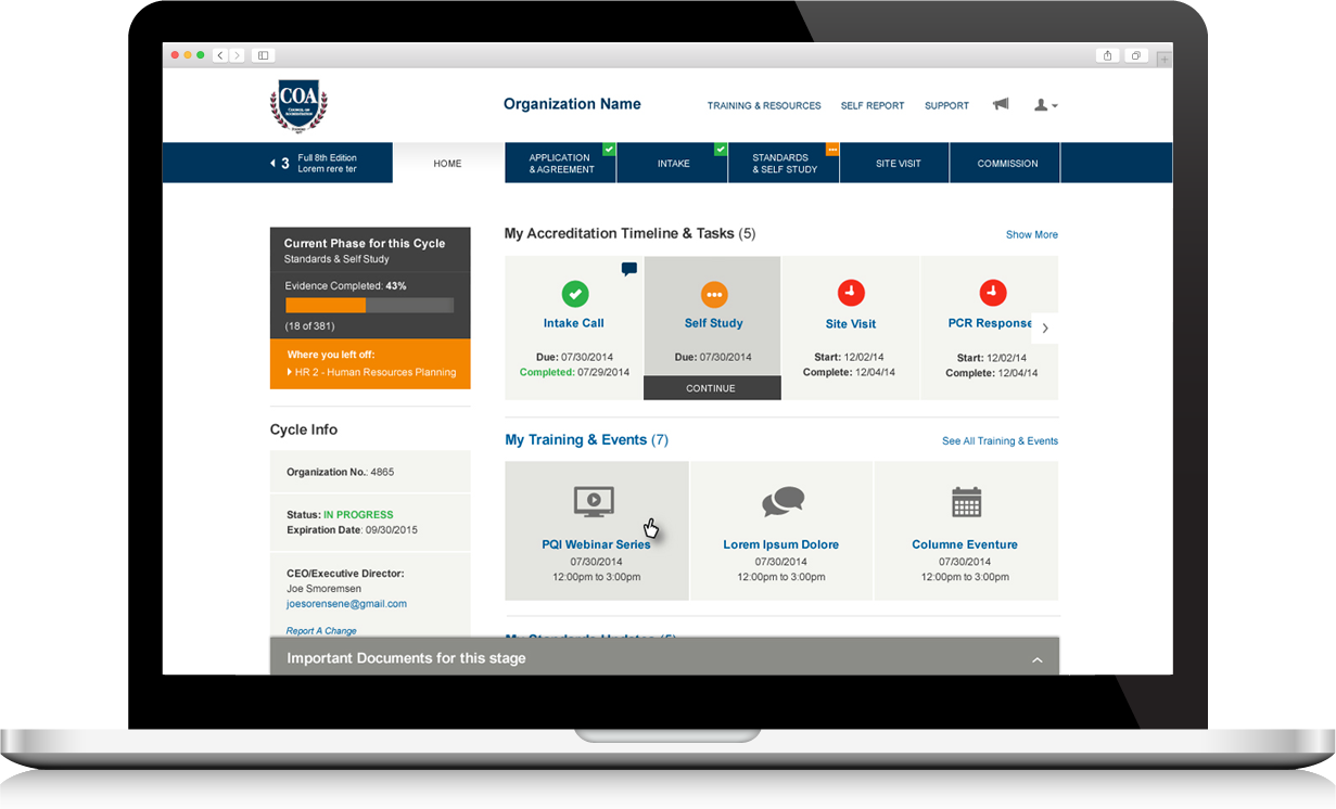
Once we established the governing navigation pattern--Process Steps--we moved on to visualizing key screens and flows. To make the accreditation process more intuitive, we provided users with an overview of the process and where they were in that process. Moreover, we learned that users typically review the standards before they provide the accreditation info, so we created separate areas in the application: One area where they review the standards, and another area focused on providing the accreditation info. And, most important, we reduced the amount of text and leveraged visual design to provide waypoints within the process.
And because the COA web application is run on the Salesforce.com platform, Busse Design created custom HTML and CSS for select screens that could be more easily brought into the platform.
Read more case studies
Arlo by NETGEAR | Baynote | Delta Dental | Instart Logic | Monotype | Sybase | Tableau Software


